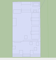
(Designs for the Ochaya Tea Room, CONvergence 2012.)
Basic flat layouts of where the room objects would be going. Wasn't going specifically for the correct size of everything, some things are up in the air, so I figured I'd play it safe and could downsize which would be faster than scaling up.
Added basic shapes in and blocked shapes. The original screen, go table and long table can be seen on the top, I did those after the basic layout was done. Wasn't really planning on putting them in. Sometime later I added said pieces, and got some plants from the online warehouse. Also those lanterns, the red is a little atrocious. But the example is needed.
This is what I have done so far. Added in more textures and items to fill out the room. The smaller screens were redone. We need to get reno information before I can work on the layout anymore though.


No comments:
Post a Comment